This article was part of FORUM+ vol. 30 no. 1 | 2, pp. 64-67
Laying down colours and covering up layers
Aline Verstraten
The daily life of Aline Verstraten provides a starting point for her paintings, in which her partner often appears. In this way, she explores the relationship between the intimacy of her direct surroundings and the necessary distance she takes as a painter from the subject. In this article, she connects some experiences with and some thoughts about colours and layers with her two most recent paintings.
Het dagelijkse leven van Aline Verstraten vormt het uitgangspunt voor haar schilderijen, waarin haar partner vaak voorkomt. Op die manier verkent zij de relatie tussen de intimiteit van haar nabije omgeving en de noodzakelijke afstand die zij als schilder tegenover het onderwerp moet nemen. In dit artikel verbindt zij enkele ervaringen met en ideeën over kleuren en gelaagdheid aan haar twee meest recente schilderijen.
The sun was setting during one of our walks in the woods in our neighbourhood. Because it was a familiar route, I imagined my partner and I had deepened the path about half a millimetre through simple repetition over the past few months. In return, we had undoubtedly left at least half a millimetre of our shoe soles scattered upon it. As the sun slowly went down, the light on the trees slowly went up, setting the foliage ablaze and transforming the trees into torches. All colours faded beneath this line that indicated the end of the day, as if the last sunrays severed the colours from their surroundings like a laser cutter, lifted them up and pushed all of them into one last oversaturated spectacle. However, the last ray of sunlight did not cut all colours completely loose, only passing through some of them like a blunt knife. This became abundantly clear in a patch of grass, which was not green anymore, but exuded its greenness, hinting at the true wavelength nature of colours. The green rose like a giant natural pan,1 about a micrometre above the blades of grass, making the air tremble as if it were the warmest green on earth. Its heightened temperature was further confirmed by its movement, as it gave the impression of heading towards us, just as the longer wavelengths of warm colours like orange or red tend to do. Perhaps the early twilight had the magical ability to stretch out all wavelengths a few nanometres, not too many to change our perception of these colours, but just enough to give them a very subtle ethereal quality. As our eyes were unable to pin down our perceptions, we became slightly disoriented. In this way the green was here and there, between the grass and the air. As we passed it, I took it home with me, together with some violets.

Verstraten, Aline. Avondglas (Evening Glass). 2022, oil on panel, 15 x 20cm © Aline Verstraten.
When we arrived back home, it was dark. The previously collected colours, however, were still dancing before our eyes, as if black were their preferred background; as if only black had the ability to set them truly free by swallowing the objects to which they owed their existence, our eyes included. The tingling, teasing dark awoke a sudden need to put these colours down. Stumbling through our apartment, I reached my atelier just in time. I took a small wooden panel, placed it on the tabletop easel, plucked the colours from the air and deposited them in the paint.
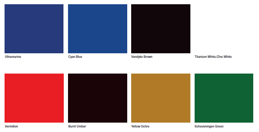
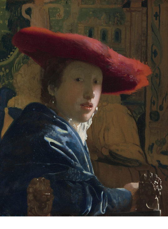
This did not work perfectly. Suddenly, the green was almost gone and the only blue that stayed was a French ultramarine, mixed with the usual Vandyke brown. The little green that remained was a Scheveningen deep green, mixed with titanium white to make a glass appear in his hand with four simple brushstrokes. It was not as green as I hoped it would be, not as brilliantly green as the highlight in the eye of Vermeer’s Girl with red hat (c. 1669). As the green disappeared, unexpectedly the ultramarine became the subtle eye-catcher. It broke loose from the brown, claiming the space by visually expanding it and giving rise to the objects in it, uniting everything along the way. And yet, its own location remained impossible to pinpoint, as it continued to float in a semi-attached way underneath and above the paint. If Martin Heidegger’s quote ‘Appearing is a not showing itself’2 hinted at a colour, it would be French ultramarine.
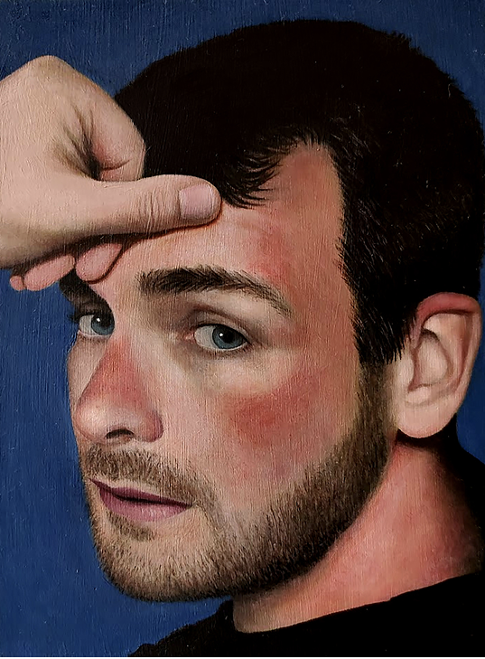
Verstraten, Aline. Het rood trekt nog weg (The red will fade). 2022, oil on panel, 15 x 20cm © Aline Verstraten.

Verstraten, Aline. Het rood trekt nog weg (The red will fade) detail. 2022, oil on panel, 15 x 20cm © Aline Verstraten.
I turned the lights back on and took a step back. The abundance of clarity seemed to put every colour back in its place, freeing up space to take another look. Caught off guard, he looked over his shoulder. I managed to materialise this movement right before his eyes could meet mine. Our duel of gazes remained visible in the paint; at the very last moment I pushed his left eye slightly more to my right.
The paint mixture of the dark white in his eye contains a little bit of vermillion, some Vandyke brown and a decent amount of titanium white. In contrast to zinc white, titanium white should have provided an opaque layer of paint. However, because the layer is applied quite thinly, the previous location of his iris remains visible. Throughout time, this upper layer of dark white in his eye will fade. This will reveal the previous location of his blue gaze and give him the ability to look at two places at the same time. However, looking everywhere does not equal seeing everything.
The detail reminded me of a pentimento3 I once saw in a Renaissance portrait of a woman. As the upper layer started to fade, it revealed a change of mind of the painter. In the top layer, the nail on the tip of the right index finger was moved a little bit upwards, elongating it ever so slightly. As this layer faded, the nail started to lose its extension and seemed to grow back inwards. Maybe this signalled an unconscious desire of the artist to capture eternal youth in the materiality of the paint itself, an inversion of the supposed growth of hairs and nails after one’s death. This sets a new challenge for the extremely ambitious painter: to visualise Zeno’s arrow paradox4 by cutting up a seemingly continuous life into endless visual frames, painting these in layers with the very first image of life at the bottom and the oldest on top. As the upper layers begin to fade, the painting will become the slowest animated movie on earth, showing how recent memories are always the first to go. James Elkins notices something similar in Henri-Georges Clouzot’s 1956 film, The Mystery of Picasso. According to Elkins, the way Picasso opaquely covers up his mistakes layers the painting with moments of time. He thus builds a memory in paint with his first idea buried at the bottom and his most recent visible on top.5
Unlike the local change of the shrunken nail, the final appearance of a painting can change across the whole surface as well. For instance, the warm red upper layer, used to inject painted skin with life, often dwindles away in older paintings. This gradual loss forces the painting to show its verdaccio, a greenish underlayer. As this layer is frequently referred to as the dead layer because of the perceived lack of vitality in the human figures at this stage of painting, the painting dies once again when the red gives way and the green resurfaces. Maybe the painting had been dead all along and the final layer only acted as the morbid make-up of a laid out body.
Many older paintings lose parts of their upper layer through environmental conditions, such as too much sunlight, as if the sun comes to reclaim the colours it once gifted the painting. Other layers get lost through a much too thorough restoration process. Scrubbed clear of its outer shell, the painting exposes a lack of essence at its physical core. If restorers are not careful and want to uncover too much too quickly, they risk destroying what they are after in the process. Laser focus is the minimum requirement as they uncover and recover.
Vermeer, Johannes. Girl with the Red Hat. c. 1669, oil on panel, 22,8 x 18cm. National Gallery of Art, Washington D.C. Wikimedia Commons. Accessed 5 Oct. 2022.

Vermeer, Johannes. Girl with the Red Hat detail c. 1669, oil on panel, 22,8 x 18cm. National Gallery of Art, Washington D.C. Wikimedia Commons. Accessed 5 Oct. 2022.
It is this kind of focus that is difficult to achieve when I am about to begin a new painting. Where do you direct your attention to when there is nothing but a white panel? Where to start? Like a lot of artists, I try to overcome the fear of the white by applying a layer of colour, in this case an imprimatura6 of burnt umber. After this, the question is: how to continue? With each step, it gets more complicated. Keeping an eye on the painting as a whole throughout the process poses a great challenge, especially when working with the unpredictability of layered colours.
This is why I have trouble remembering, for example, what colours I have used to mix the background of The red will fade (2022). Probably a lot of ultramarine and cyan blue (at first I was going for a traditional clear sky), a tiny bit of yellow ochre (then I changed my mind and was aiming for a green), perhaps even a dot of vermillion (in the end, I wanted to use some red to push the mixed colour more to the surface).
Luckily, this lack of planning is not a problem with the industrially produced version of ultramarine. It would certainly have caused some trouble when lapis lazuli was still ground to produce this very rare and precious colour. It was so precious that during the Renaissance it was mostly used to adorn the Virgin Mary’s robes. Adorn in the literal sense, as it was only applied as a glaze in the final layers, putting its transparent quality to good use. In this way, the painter made the deep blue descend from the sky, only to lift the subject it enveloped back up again, out of our vulgar timeline. We can look at it, but we cannot grasp it.
Still, the ultramarine continues to appear, even here, mixed with other colours and relegated to the background. There, it keeps denying its blue withdrawing nature. Optically, we should perceive it as receding, but here it springs towards us and pushes the subject almost out of the painting. Although everything seemingly manages to stay in place, the ultramarine sneakily squeezes out the vermillion of the painted skin through its pores, making the sunburn virtually tangible, making it act like a rash, the blood rushing to the surface. Maybe there is even some blushing underneath caused by my unabashed staring. The painting has little room to transpire. The eternal blue wants to cool things down and cleanse itself of the temporal red as quickly as possible. It tries to purge the already perished skin cells, rejecting the vermillion along with it. I desperately try to counter this and hold the image together while painting the last intense layer, picking up the flaked off skin cells with my paintbrush to paste them back on, but it proves to be a delicate balancing act: as soon as I push the red onto the panel too much, the open pores of the previous layer, still wet, absorb it all. The sinking of the colour signals my lack of patience and caution, as I frantically use my brush and gaze to continually barge into the painting instead of letting the surface heal. As I realise I am about to lose oversight, I stop for a moment and lean back slightly, wiping the sweat off my forehead. Subsequently, I try to proceed more slowly, ignoring the damage that has probably already been done. Time will reveal my mistakes once the painting begins to shed the currently visible red. Scattered patches of vermillion will appear underneath, revealing the depth of the burn where I went too far by pushing the red paint right through. Perhaps this second-degree burn will invite restorers in the future to scrub it down all the way to its green underlayer. From there, they can build up a new and healthy skin with the correct amount of red. The intimacy of our red, however, will certainly be lost.
+++
Aline Verstraten
is conducting her PhD research at PXL-MAD School of Arts and the University of Hasselt. She is exploring the concept of the withdrawing image through a combination of reading, writing, and painting.
Footnotes
- Didi-Huberman, Georges. “The Art of Not Describing: Vermeer – the Detail and the Patch.” History of the Human Sciences, vol. 2, nr. 2, 1989, pp. 135-169. ↩
- Heidegger, Martin. Being and Time. State University of New York Press, 2010. ↩
- ‘The word pentimento is derived from the Italian “pentirsi”, which means to repent or change your mind. Pentimento is a change made by the artist during the process of painting. These changes are usually hidden beneath a subsequent paint layer. In some instances they become visible because the paint layer above has become transparent with time.’ Glossary. The National Gallery, 2022, www.nationalgallery.org.uk/paintings/glossary/pentimento. Accessed 3 Oct. 2022. ↩
- Of interest here is how in this paradox Zeno divides the flight of an arrow into temporal points, imagining how the arrow is motionless at each point in time. In this way, he wanted to prove motion is impossible. More explanation about this paradox can be found at: "Zeno’s Paradox of the Arrow." Philosophy 320, 2016, aculty.washington.edu/smcohen/320/ZenoArrow.html. Accessed 3 Oct. 2022. ↩
- Elkins, James. What Painting Is. Routledge, 1999, p. 168. ↩
- An imprimatura is a transparent layer of colour that is applied as the first layer in the painting process. ↩
More from this theme
Filmstills Het Bels Lijntje. Imagination of the memory
Maurits Wouters
A fracturing practice
Patrícia Domingues
Tactile composition
Marloeke van der Vlugt
